
PEEP
A real estate transparency appSept 2023 - January 2024
Renters and property management are a vulnerable sector of the real estate market with a great interest and need for new tools to help them bridge the trust gap between them. With the historical tendency for the real estate industry to lag in their use of technological implementation, I felt passionate about finding a solution for the industry’s largest number of users: Renters and their property management counterparts.


▸ Problem ◂
The rental market is challenging, seems like both renters and landlords are often dissatisfied with their interactions with each other. As a person under 30, it's hard to remain unexposed to the hardships of the tenant-landlord experience; dissonant prices, hopelessness, and mistrust are common topics of conversation among peers, so while the problem was obvious from both personal and interpersonal experience, what stood out to me was the even more obvious lack of available solutions and resources.
“How Might We kickstart the tenant-landlord transactions on a more transparent note?”
▸ SOLUTION ◂
The goal is clear: We need to empower both sides of the story when it comes to the rental market, we need to promote trust and collaboration among the two main fractions (Tenants-Property managers) and we need to have accountability to promote best practices.
My proposed solution quickly took the form of a review platform, where both property managers and tenants could share their experiences with each other and access more information, helping them enrich their understanding before it is too late.
We can’t trust what we can’t see, we need to take a PEEP.
▸ rESEARCH ◂
The objective became to find both tentants and property managers/landlords that are familiar with technology and have looked for a property/tenant in the past two years, to have an accurate sense of the navigation process of the current rental market.
Because I needed to empathise with two main users instead of one, I created two interview process depending on the user’s profile, while keeping the same questions in mind: How do they navigate the reantal market? What tools and resources do they use? How intrested are they in a new tool and what would they expect from it?
The topic did ignite a lot of interest and I was lucky to recruite users easily from atending my usual co-working space and a couple of UX meetup weekly events I attended at the time. Participants wanted to discuss their personal experience and express a lot of excitement over the project. To my surprise, there seemed to be as many positive experiences as negative, and participants often found themselves realizing they cared about the topic more than they realized.
After conducting interviews on 5 selected participants I did an affinity mapping exercise, using notes and extracts from the recordings. Themes and patterns started to appear.
Affinity Map:

Next I dove deeper with the empathy map model, thinking about what these main users experienced in the rental market.
Empathy Maps:
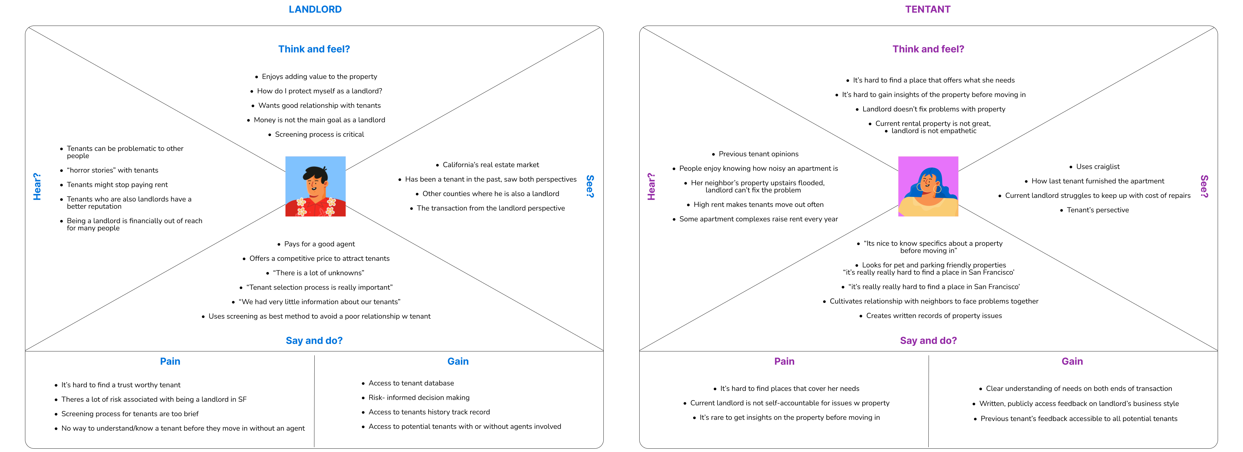
I developed personas that represented big blocks of the users I encountered - the part-time landlord who wants a low mantinance retirement plan, the young professional who values lifestyle and has few financial restrictions, and the tenant who has very specific needs and is more financially conscious.
Personas:

▸ architecture◂
From the research, I solidified the idea of a review platform model, where users can refer to each other’s past experiences to guide future ones and build trust between one another.
It was time to develop user stories and understand how users wanted and needed to interact with the product. There was a path for both users, the bridge between them slowly started to align.
I synthetized an MVP from the user stories I decanted.
User stories
MVP chart

I followed by developing red routes, I wanted all users to access all functions, because I often rant into scenarios where tenants also identified as landlords, often owning a unit in another city, and, after all, this is a transparency-focused app, so it was important to me for users to access both sides of the story. They are not segregated to a different version of the app depending on how they choose to present themselves, a tenant, for instance, can access other tenants' profiles or request to connect with them.
Other key features included the search systems, the map exploration, and the capacity to review property managers independently from the property itself.
Red routes

▸ Design ◂
Sketches
Since it was conceptually important for me to have users immediately access properties and people, my early sketches contemplated a main screen focused on properties (the middle ground) and a bottom navigation bar that would allow them to access tenants on one side and landlords to the other.
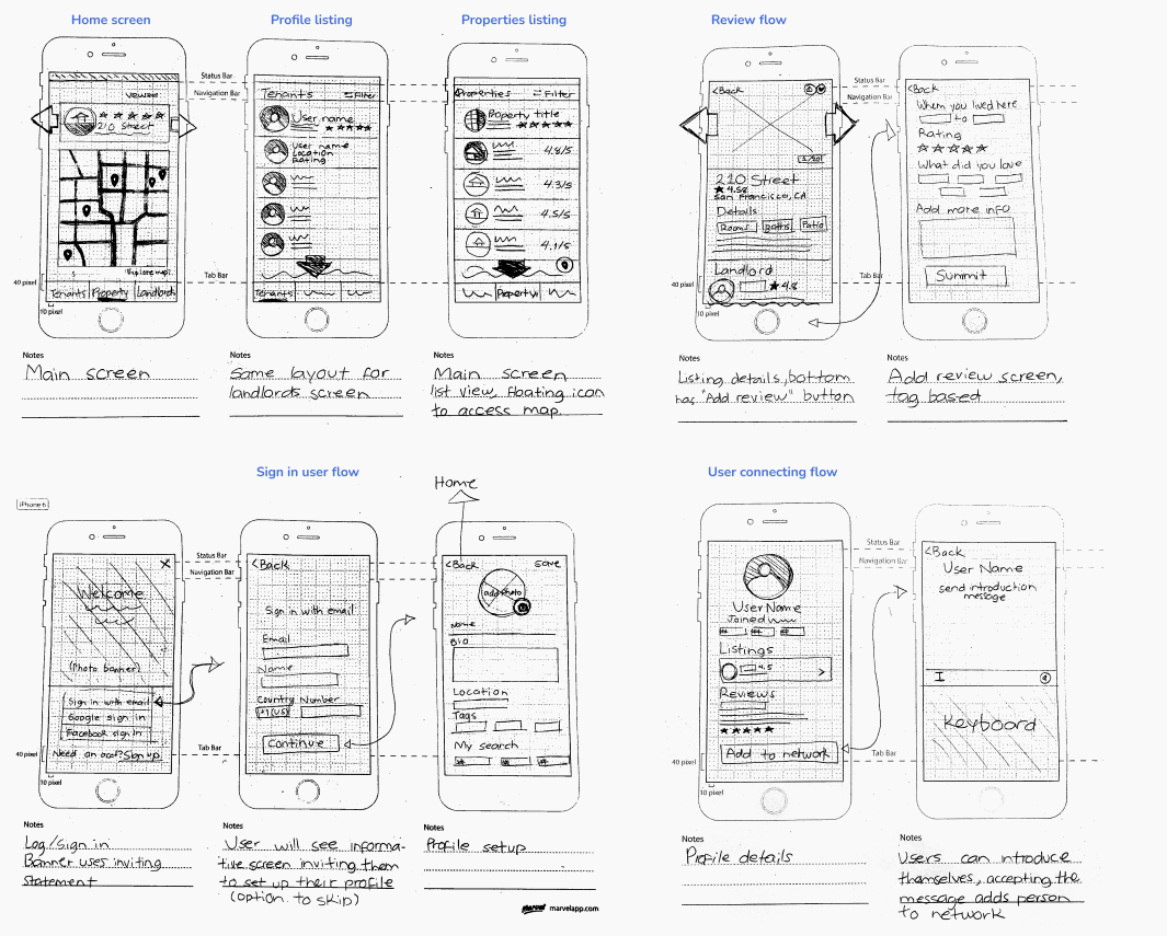
Wireframes:
After guerilla testing of the sketches there was a couple of changes made:
✦ Add a personalized search filter option to the profile creation screen
✦ Make a Sign in/Log in toggle to navigate between the two options
✦ Add the option to create new tags based on user’s needs

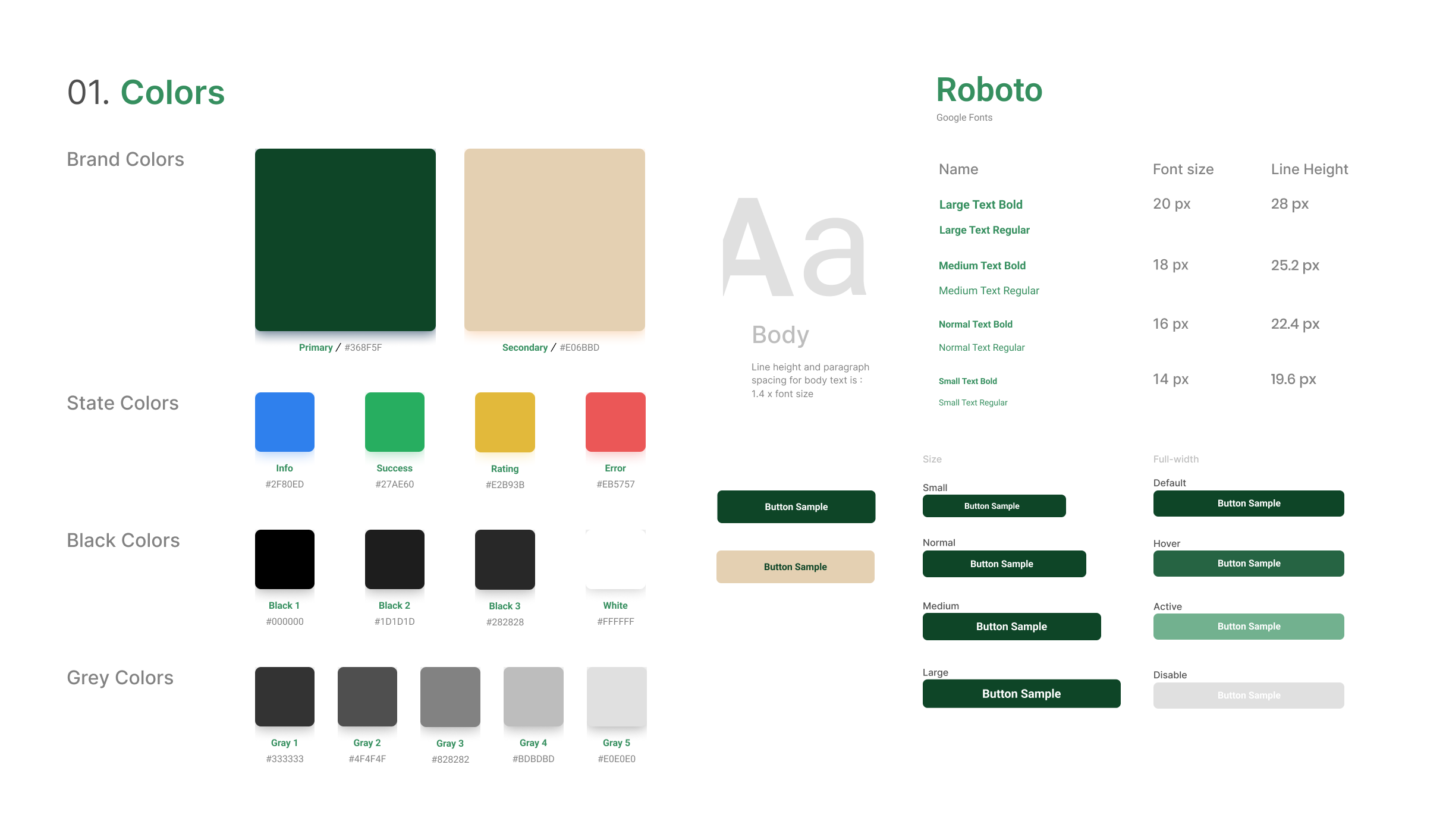
Style Guide
The core concepts for the brand development were a response to the users' feedback: They craved a safe space, so the app needed to visually reflect that, to inspire them to trust and be trustworthy. I wanted the app to feel inviting, calming, and homey itself.
I refrained from harsh contrasts and overly stimulating graphics. For my palette I chose a dark green as a primary color, to evoke neutrality and a safe space, and a neutral beige as my secondary, to create a soft environment that feels comfortable to the eyes.

▸ Testing◂


First Round
I conducted 5 moderated tests on my Hi-Fi prototype to assess whether the app satisfied users' needs and usability features.
The following findings were made:
✖ Several users had trouble finding the “Create a profile” process satisfactorily
✖ The tags process is unclear, and the click response is not demonstrated
✖ There is no “create your own tag” process
✖ Some “back buttons” don’t work
Recommendations
✦ Add a confirmation screen after clicking “Done”
✦ Demonstrate the tag system to users
✦ Demonstrate the “create your own tag” process
✦ Double-check flows for any disconnections
Second Round
After implementing the first round of changes and a second round of usability testing, additional findings were made:
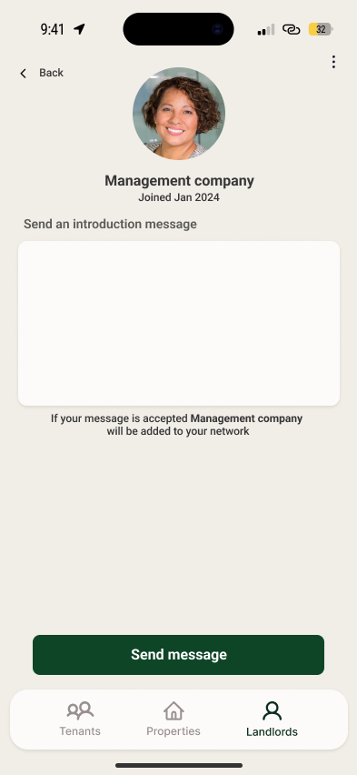
✖ The “add a user” process is unclear, users can’t tell when they’ve completed the process
✖ Users can’t find a way to edit their profile
✖ Users can’t go back to the “log-in” screen
Recommendations
✦ Add a confirmation screen after clicking “Send message”
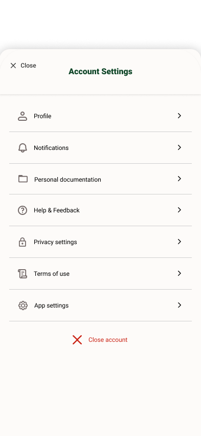
✦ Add “Profile” button to the navigation drawer
✦ Add “Close account” to the navigation drawer
▸ Conclusions & Next Steps ◂
This project was fascinating from the beginning. The challenge was to bring together two different users (Tenants and Property managers) who may initially seem like complete opposites, but upon close inspection, they reveal having lots in common; both share many of the same pain points and may lack understanding of their counterparts. The research was eye-opening and showed a deeper, more human side to a transaction far more complex and relevant to users' lives than one seems to assume.
That very same dichotomy between the way the rental market affects its users and the powerless sentiment of many users seemed to be the motor behind the interest I received throughout the entire process of this project. This leaves me no doubt about the project’s scalability, with some of my initial ideas (not implemented due to time constraints) including the users completing their profiles with documentation and in-app verifications to back their tenant application, making them able to apply through the app, and property managers being able to promote their properties in-app, helping them not only find the right tenant but the right tenant find them.
This project will continue to roam in my mind indefinitely since I see so much potential and impact in it. The rental market will continue to be a difficult terrain but I walk away with a greater understanding of its users, convinced that technology could help them bridge gaps and empower them greatly.